All a Matter of Perspective

I hike. On one of my favorite walks, along the Buckeye Trail in Hinckley Reservation, the path skirts the edge of a field adjacent to woods. Usually there is a cairn (man-made pile of rocks) there. For the first 6 months, the cairn was unchanging, but then – it had been knocked down. I was sad.

The rocks remained.

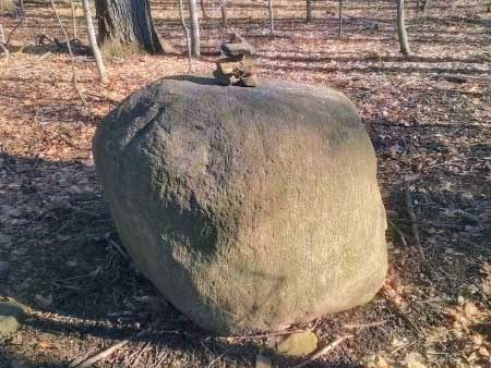
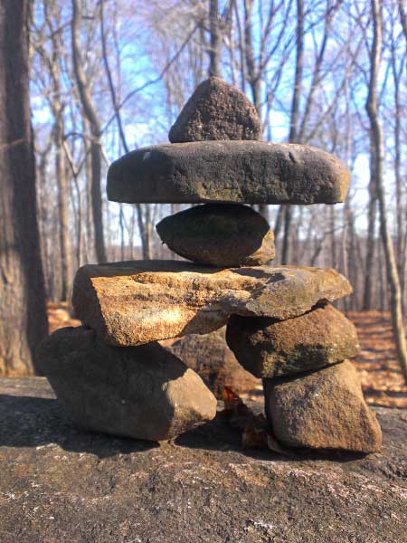
I don’t remember if we started to rebuild the cairn, or if someone else did. But it did reappear. Now we and other unseen hikers add rocks and sometimes wood or nutshells. My perspective about the tumbled carin changed and I look forward to see the latest configuration. Here is a recent one:

Cairn in Hinckley

Cairn in Hinckley

Speaking of perspective, when I step back – waaay back – here is what it really looks like.

Cairn in Hinckley

Cairn in Hinckley

Rosemarie Hanus makes beads, but not rock cairns in her home studio.  See these beads at EtsyArt Fire, or her Spawn of Flame website.

The Ice Stopped Here

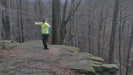
There are many ledges in Northeast Ohio thanks to ancient glaciers. They pushed rocks along as they moved; when they melted, the rocks remained. We took advantage of freakish warm weather here in our January winter and hiked the local Top O Ledges, part of Hinckley Reservation.

The Ice Stopped Here

The Ice Stopped Here

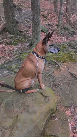
The dog was quite happy. He has spied… something.

I Spy with My Little Eyes

I Spy with My Little Eyes

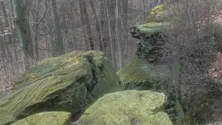
Here is another gratuitous ledge photo.

Overlooking a Ledge

Overlooking a Ledge


Revisiting Old Designs

Once again I was looking at some of my designs that I don’t make anymore. One is a beautiful bead called Purple Majesty.

Just as with a cooking recipe, sometimes changing one ingredient gives a totally different result. This time, the background is more pink than purple – and the funny thing is that the background color was the one that was the same.


Making Some Cabochons

Today, I am going to make some cabochons. Well I’m going to attempt to make some anyway.

At least 2 years ago, my friend Linda gave me some kiln wash to do some fusing. I was fearful. Of what, I am not sure – maybe of breaking my kiln somehow.

So right now, I have some test pieces in the kiln and they are ramping up to slump. I was wondering how I would tell that I got full coverage with the kiln wash. The kiln wash is pink! It was easy.

If you have no idea what I’m talking about, well, I hardly do too, but here is the general idea. First I had to prepare that kiln shelf by putting something on it so that the glass won’t stick to it (or worse yet – to the kiln.) I prepared some marble like glass pieces in my normal style, with the silvered ivory accents. Put those into the kiln and get them hot enough so that they spread out flat. Cool. (Temperature and hopefully aesthetically too!)

Happy Thanksgiving!


Oak Hill Trail

Recently revisited a trail that we haven’t been on in years. It’s in the Cuyahoga Valley National Park and is in the Oak Hill Day Use area. The inner trail is an easy trail, only 1.8 miles and an elevation change of 50 feet. It interweaves with another, more difficult trail called the Plateau Trail (4.9 miles, 200 feet elevation change.)

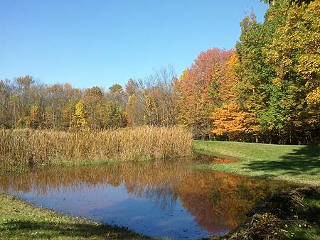
We did a little of both. Our first loop on the Plateau Trail took us to Meadowedge Pond. You can see where the pond used to end – where the tall grasses are. Somebody (beavers, likely) built a new little dam, extending the pond a little. You can see just a little of the dam in the lower right corner of the photo.

Meadowedge Pond, Cuyahoga Valley National Park, Ohio

Meadowedge Pond, Cuyahoga Valley National Park, Ohio

Although it is not a challenging trail, it has many beautiful passages – such as this little footbridge over a tiny ravine.

Footbridge on the Oak Hill Trail, Cuyahoga Valley National Park, Ohio

Footbridge on the Oak Hill Trail, Cuyahoga Valley National Park, Ohio

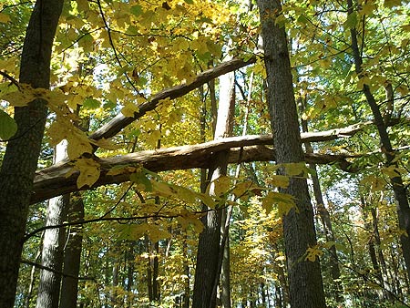
Check out this fallen tree – suspended in the air.

Good Catch

Good Catch

I am looking forward to going back and exploring more of the Plateau loops.


Choosing my New Look – Part 2 – Museums

How about art museums?  I ramdomly chose a few museums from a random article (how’s that for scientific?)

Here too, there were neutral backgrounds with bright splashes of attention getting color.

Random Museums

Metropolitan Museum of Art Glacier blue background, white nav box, Chestnut Brown and Black font

Smithsonian Background gray – green tint? Lots of bright pictures, blue nav tabs with white font.  Some Blue nav fonts also.

MoMa – Museum of Modern Art – white background, black navigation font, changing blocks with info – bright colors, with a orange sign in bar at the bottom.

The British Museum –  White background, black nav bar with white font.  Multi-column info area in center, white with black font – looks like a newspaper

Louvre – – White background, with peach fade to gray info area, black and brown fonts.

Vatican Museum – White background, Orange and deep red font

Well, it seems like the thing to do is design something very neutral.  That makes sense, since I wouldn’t want to detract from my glass items anyway.  Here’s where I want to argue with myself.  I want business cards with color – preferable matching my ArtFire and Etsy shops, but I don’t want a bunch of beads scattered about.

I decided to make a gradient, with just one set of beads.  It turned out much more colorful than I intended.  The orange was supposed to be muted!  Because the banner was so bright, I ended up setting the background of that to a brighter orange.  I think I still have work to do!

Header for Spawn of Flame Artfire Shop


Choosing my New Look – Part 1 – Luxury Brands

Recently, ArtFire made the announcement that it was going to be changing the look of everybody’s shops.  As a part of this, we would need to develop a new header with a different size.  In addition, we had control over more of the colors in the shop than in the past.

I thought that this would be a good time to do some research to help me decide on the color scheme to use.  Currently, I have different colors in my different shops – not such a good idea for branding, right?

I got the idea to look at luxury brands and see what colors they use (because my beads are luxury brand, of course…) I found an article at Forbes that listed the top luxury brands.

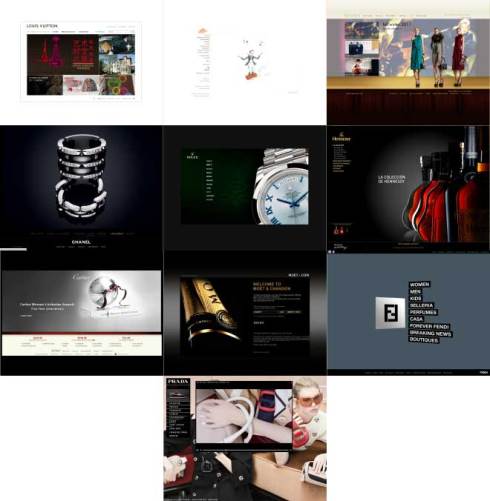
Luxury Brands Websites

Luxury Brands Websites

#1 Louis Vuitton / White background
#2 Hermès / White background, grayish font, orange logo
#3 Gucci Brown wood panel at bottom, gold band, images, gold lettering
#4 Chanel / Black and White with grayscale images
#5 Rolex / Black background, white lettering
#6 Hennessy / Black background, black to neutral brown side panel, gold and white lettering
#7 Cartier / Black background, white nav bar, neutral brown/gray font, splash band of deep red.
8 Moët & Chandon / Black background, gray t0 black splash band, gold and soft white lettering
9 Fendi / Steel gray/blue background, black nav bar, white lettering
10 Prada , a background image of a runway show area, popups of mostly black with white lettering.

OK.  I see the pattern – very little color to distract from the products.

But!! I’m an artist!  I want color!!  What to do??!!

Tomorrow, I’ll show you where else I looked.


Pollen Explosion!

While snapping pictures of our Rose of Sharon bushes, I snapped this dynamic photo of a bumble bee. She was laden with pollen already, and her poking around in the flower caused a spray of pollen speckles.

Pollen Explosion


Blast from the Past

I used to make these nautilus beads and other big hole beads.  This was before the European Charm beads such as Pandora, Biagi, and Chamilla became so popular.  They are also way too big to put on a bracelet!

Green and Aqua Nautilus bead


I’m getting a hankering to make more of these.  What do you think?  Should I add these back into my bead arsenal?


Secondary Colors

Just some glass lampwork beads!

Short and sweet?  I handmake make these and I like to look at them.  See more at Etsy and ArtFire.